Business Insights Dashboard
Freelance Project
Description
For this project, I designed and developed a multi-layered Tableau dashboard for a simulated e-commerce business. The dashboards showcase key insights across multiple dimensions, such as sales performance, profitability, shipping mode analysis, customer segmentation and discount impact.
Tools
The goal was to create a clear and interactive dashboard that enables business leaders to make data-driven decisions.
They were especially interested in:
• Identifying high-performing products
• Optimizing shipping methods
• Understanding how discounts affect sales
I cleaned and prepared the dataset to ensure it was consistent and accurate. Then, I built six dashboards in Tableau, which are presented below.
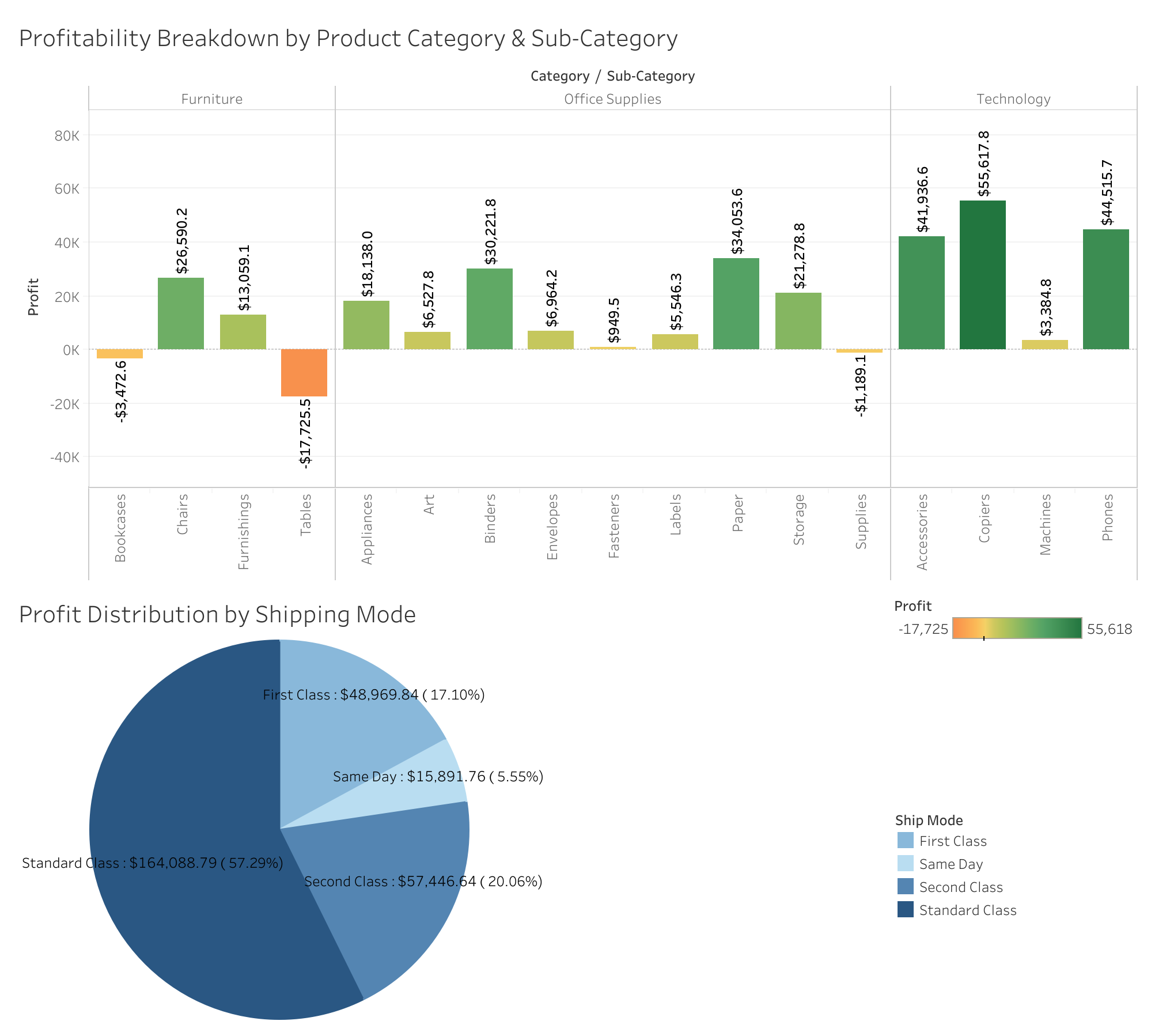
This dashboard provides a comprehensive view of profitability across both product categories and shipping modes.
- The bar chart breaks down profit by category and sub-category, highlighting which products are the most profitable, and which may be losing money (e.g., Tables and Supplies).
The pie chart displays profit distribution by shipping mode, revealing that Standard Class shipping contributes the majority of profits (over 57%), while Same Day shipping has a minimal impact.
Insights:
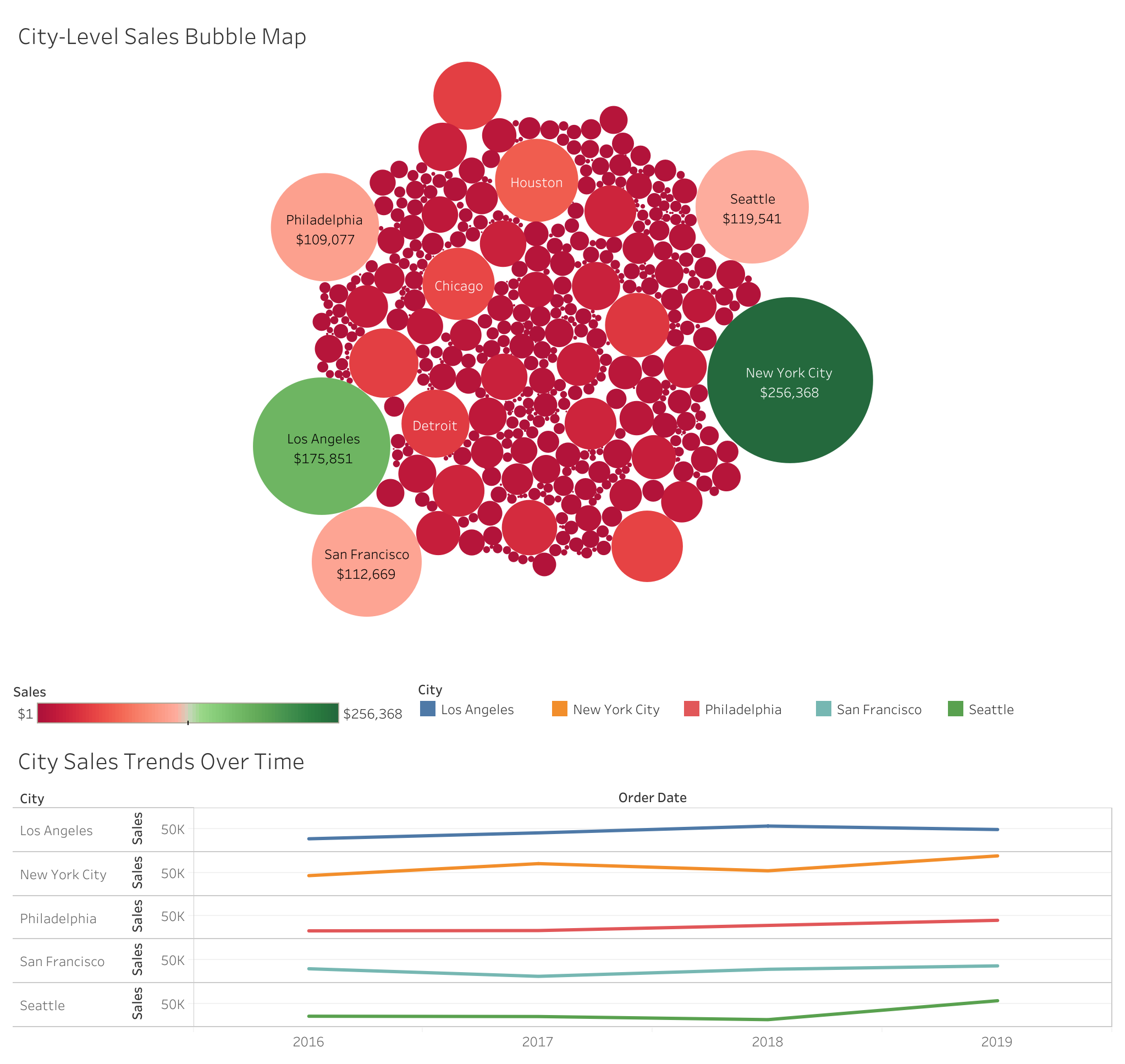
This dashboard presents both geographic and temporal views of sales performance across major U.S. cities.
The bubble map highlights total sales by city, with bubble size and color indicating sales volume. Notably, New York City, Los Angeles, and Seattle emerge as top-performing locations.
The line chart below shows city-level sales trends over time, helping uncover seasonality or consistent performance growth between 2015 and 2019.
Insights:
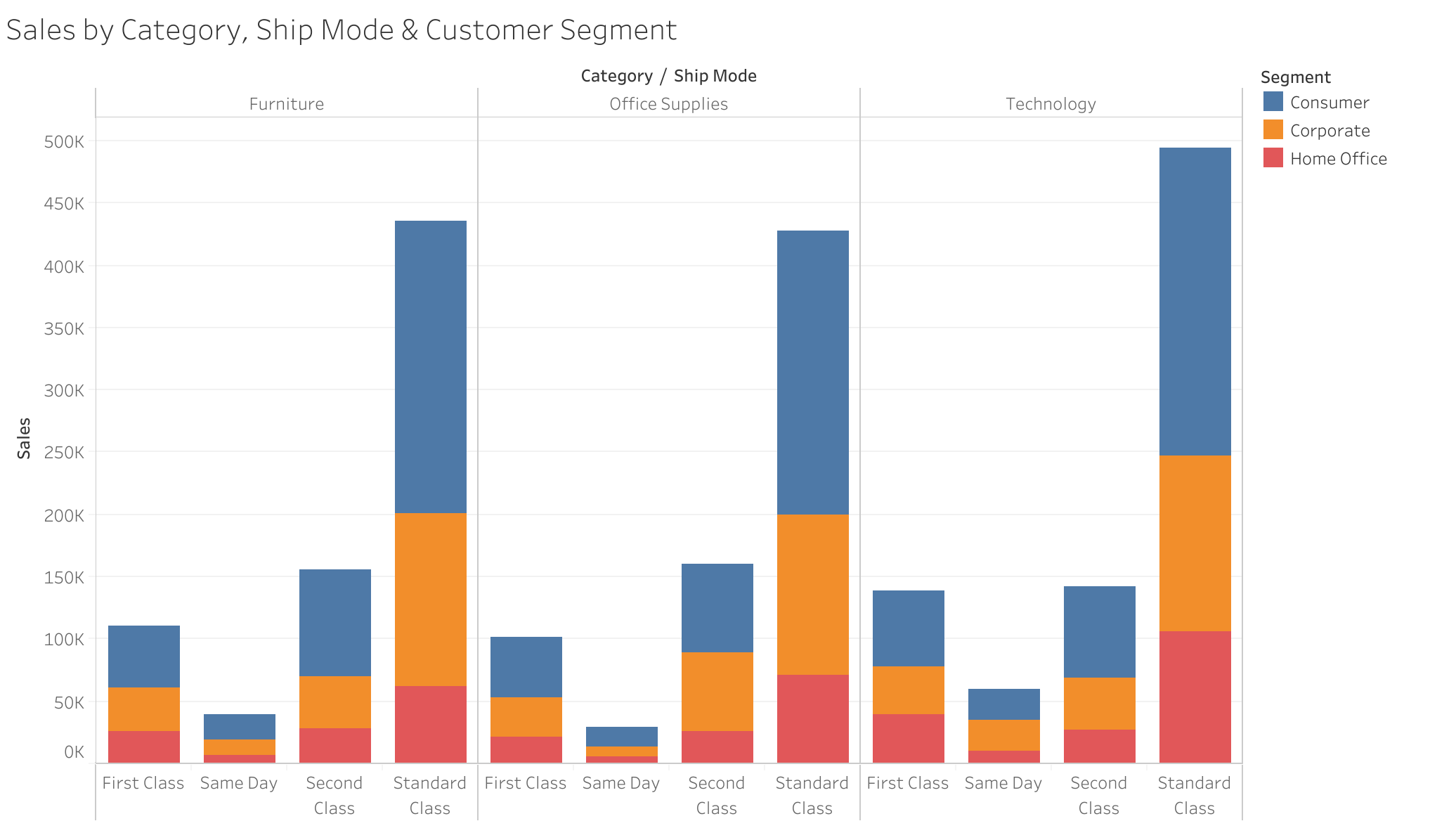
This stacked bar chart visualizes how sales are split across product categories, shipping modes, and customer segments.
It reveals purchasing behavior and shipping preferences across Furniture, Office Supplies, Technology, broken down by shipping class and segmented by customer type.
Insights:
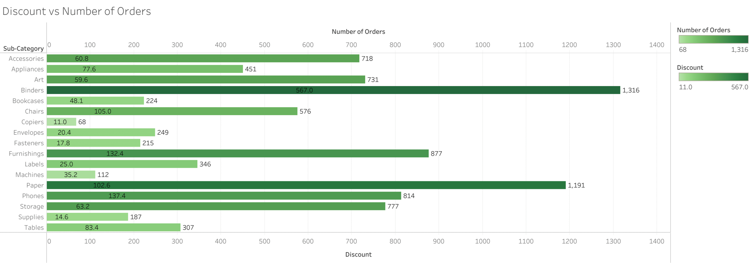
This dual bar chart compares the total discount given to the number of orders for each product sub-category.
It highlights where high discounts drive orders and where they have little impact.
Insights: